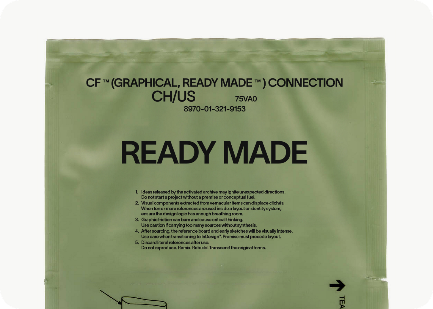
READY MADE: Vernacular materials as Open Source inspiration
Why vernacular material matters to our process (and could to yours).
We collect things most people don’t even see.
Not because they’re hidden, they’re actually everywhere.
But because most people don’t think they matter.
I’m talking about the paperwork that comes with a product but isn’t the product.
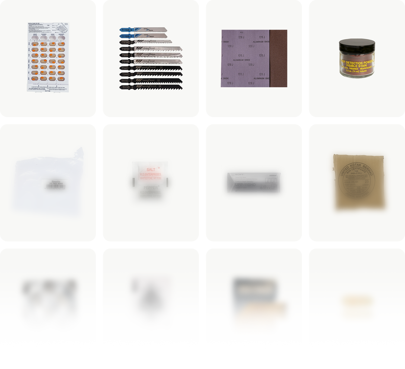
Receipts, warranty slips, instruction booklets, return forms, random shipping labels, tax folders, cafeteria signs, public office printouts.
Some of it is designed. Some of it just happened.
And yet, this overlooked graphic matter is the foundation of our most creative work!
Inspiration, but not how they teach it
Inspiration is personal.
In design school, they talk about it. In studios, they expect it.
But everyone finds their own way of making sense of it.
A lot of designers build from what’s trending, what’s shared, what’s current. And that totally makes sense. It’s fast, accessible, and part of the conversation. But it’s also crowded. Overexposed. Sometimes shallow.
From the beginning, at CLASSIC FUTURE, we found ourselves pulled toward something else: Toward the overlooked. The stuff that isn’t meant to be inspiring, but somehow, weirdly, is.
That’s where our READY MADE practice comes from.
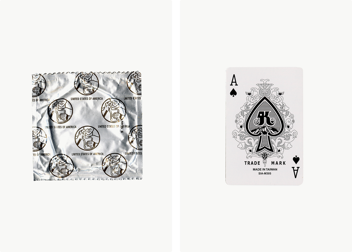
We collect graphic fragments. We scan them. We isolate details. We remix. We treat them like open-source design DNA, freely available, often ignored, but full of potential.
What most people never see
We collect things most people don’t even look at. The stuff that comes with a product but isn’t the product. Paperwork. Warranties. Instruction slips. Random printouts. Anything functional, printed, and usually tossed aside. Sometimes it’s designed (intentionally). Sometimes it’s just default layouts or auto-generated forms. Most people don’t even register them as “designed.” But to me, that’s where the magic starts.
It’s this whole world of graphic material that lives everywhere and yet is completely ignored. Before I knew anything about design, or typography, I thought fonts were just… there. Like air. Like dinosaurs. I assumed they’d always existed. Just part of the digital world. Not something people made. Not something with origin or intention.
Typography is everywhere, and yet, almost invisible.
And that’s exactly what I find fascinating. Typography is, without exaggeration, one of the most visible human-made creations on the planet. It’s absolutely everywhere. It spans every screen, every printed page, every product, every instruction manual, every billboard. And yet, for how omnipresent it is, it’s also one of the most overlooked and least considered elements in the world. That paradox, the hyper-visible becoming invisible, is what this whole archive is about.
That’s where this project began. First as a personal habit. Then, little by little, I pulled others at the studio into it. Now it’s part of how we work. Part of how we see. Part of what we teach.
It’s become our number one source of inspiration. And that’s important, because no one teaches you how to handle inspiration properly. Not in design school. And definitely not in fast-paced studio culture.
Why we call it “READY MADE”
There’s obviously a nod to Duchamp here, the whole idea of taking an object, changing its context, and letting it speak in a new way.
But we’re not being ironic about it. We’re not flipping urinals and calling it art. We’re flipping delivery notes. Tax returns. Expired receipts. And seeing them for what they really are:
raw design material.
To me, it’s like that thing Virgil Abloh said, that maybe we spend too much time designing the candle, when just putting the candle in the right space changes everything.
That’s what our READY MADE project is about.
We elevate the ignored by placing it in a new frame.
But let’s be clear: I’m not saying you should just scan a receipt and make a poster.
The real magic is not in the object, but in the DNA inside it.
The “DNA“ method
We treat each piece like a specimen.
Every one of these vernacular items carries strands of design logic, tension, composition, accident, constraint.
Not every element is valuable, but something always is.
A layout choice. A color interaction. The way type misaligns and somehow works. The fact that it was printed off-center and looks better that way.
We isolate these bits. We study them.
And then we start to remix.
Not lazily. Not literally.
We recombine fragments into new graphic strands, custom DNA for each project.
Sometimes it’s 3 references. Sometimes it’s 30. We don’t just copy, we fuse. Cinema, architecture, manuals, jazz records, brutalist blueprints, we let them mix with the vernacular.
That’s when design gets interesting again.
Why InDesign is not the lab
Here’s something I tell everyone who joins our studio:


